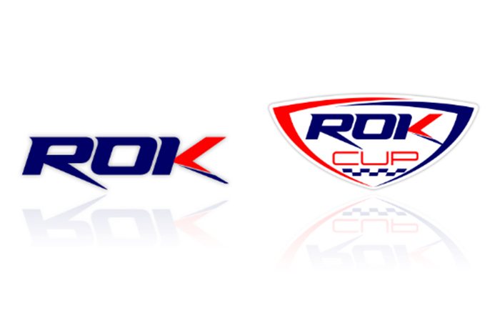
The brand by Vortex Engines renovates its look, staying true to its 20-year history but also embracing modernity at the same time, with a dynamic and original style combined with the iconic red and blue colours
After 19 years of honourable career, the ROK logo, as all karting followers know it, is making its way for a brand new one. A change confirming the essence of ROK: presenting itself to the karting fans all over the world through a technical and sporting formula always up-to-date, in step with the times and with the needs of drivers.
A renewal, however, in the name of tradition, as the presence of the iconic blue and red colours that have always distinguished ROK, still proves in the new visual identity.
Even though ROK has never stopped its continuous diffusion and growth, it has always remained faithful to its principles, making it one of the main categories in the world well known for karting promotion: steadiness of regulations, ease of use, affordable high performance equal for everyone and for all ages.
The new logo also comes to honour the never-ending activity of this project that, since its debut until today, has tirelessly been aimed at making the sport of karting more and more accessible and widespread. More than 30 ROK Cup national competitions prove it, spread across the 5 continents, as well as the extensive and always up-to-date range of 6 engines able to satisfy the needs of drivers of all ages.
Furthermore, the fact that ROK is in step with the times, is also demonstrated by the various marketing initiatives, with the ROK Talk Show standing out, a web talk show for in-depth post-competition analysis that has seen the ROK Cup Italia and the ROK Superfinal, as protagonists, but which aims to become increasingly popular.
Here comes the wish to create a new logo, with the need to offer a ROK identity, flexible and compliant with the variety of network communication channels and touchpoints in which ROK is increasingly present, both online and offline.
Press Release © OTK Kart Group


 Log in on TKART
